Product Hero
A product hero: a headline revealed word by word, two actions, a play chip that opens the demo video in a dialog, and the product screenshot in a browser window that leans back 20 degrees and stands upright as the page scrolls. The tilt is CSS on the scroll timeline. The section ships no script of its own; VideoDialog's script loads only when video is set.
Live demo
scroll inside
Sample product
Orders, stock and returns on one screen
The dashboard in the frame is a capture of sample data. Scroll inside the box and the window stands upright.
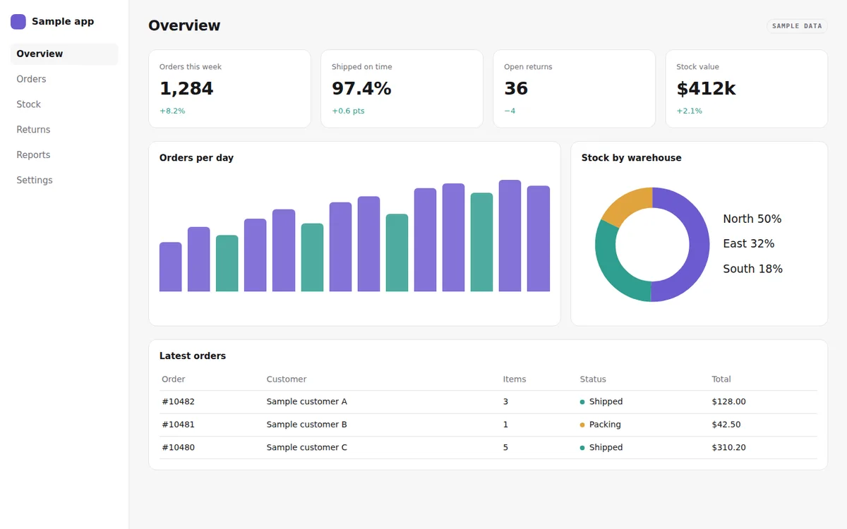
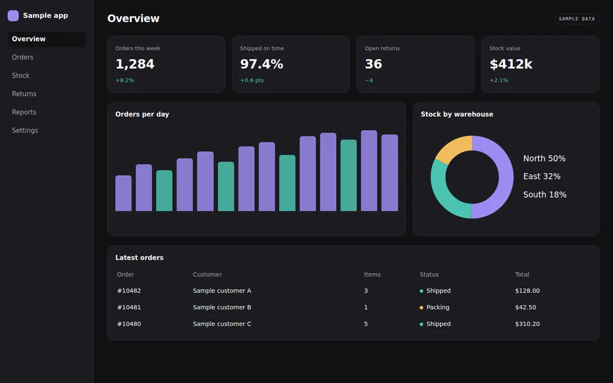
Live, from the library itself, at full size: scroll, hover, navigate away and back. The demo is never gated.
Variants · each row writes the attribute the prop writes; the section's own CSS answers
Measured
JavaScript of its own
0 B
Uses Reveal and the shared runtime (1.9 kB raw, once per site). With those included: 3.0 kB raw.
CSS 23.2 kB raw including the base tokens. Measured from a production build, and again in CI for every change that can move it.
Browser support
Chrome 135 · not Firefox · Safari 26.2; needs scroll-timeline, command. Elsewhere: Firefox shows the frame upright and still. The video opens through the inline polyfill in browsers without invoker commands (Safari before 26.2, Firefox before 144), unless polyfill is false..
Install Pro
The demo above is never gated; the source is. With a key in components.json (see account), the registry serves it like any other item:
npx shadcn@latest add @moonarc-pro/hero-product---
import HeroProduct from '@/components/moonarc/pro/HeroProduct.astro';
import dashboard from '../assets/dashboard-light.png';
import dashboardDark from '../assets/dashboard-dark.png';
---
<HeroProduct
eyebrow="Release 2.4"
headline="See every order the moment it ships"
copy="One dashboard for stock, orders and returns, updated as they happen."
primary={{ href: '/sign-up/', label: 'Start free' }}
secondary={{ href: '/pricing/', label: 'Pricing' }}
shot={{ src: dashboard, dark: dashboardDark, alt: 'The dashboard: orders this week, stock by warehouse and a returns table' }}
url="https://app.example.com"
video={{ src: ['/video/demo.webm', '/video/demo.mp4'], poster: '/video/demo.jpg', title: 'Product tour, 2 minutes', tracks: [{ src: '/video/demo.en.vtt', srclang: 'en', label: 'English', default: true }] }}
/>Without a key the registry answers 401 with an upgrade message. Everything this section composes is free: split-text, reveal, arrow-button, scroll-scrub, browser-frame, video-dialog.
Props
| Prop | Type | Default | Description |
|---|---|---|---|
level | 1 | 2 | 1 | Heading level of the headline: 1 on the page's own hero, 2 under another h1 (a demo). |
headline | string | none | Headline, split on the server and revealed word by word. The headline slot wins over it. |
eyebrow | string | none | Small label above the headline. The eyebrow slot wins over it. |
copy | string | none | Supporting copy. The copy slot wins over it. |
primary | { href, label } | none | The main action, a link drawn as an ArrowButton. The actions slot wins over primary and secondary. |
secondary | { href, label } | none | A second link beside it. |
shot | { src, alt, dark? } | none | The product screenshot in the frame: an imported image (optimised by Astro) or a URL. alt describes what the product shows. dark is a second capture shown instead under the dark scheme (data-theme="dark" on the root, or a dark system with nothing chosen). The media slot wins over it and can hold anything. |
url | string | 'https://example.com' | The address in the frame's bar. |
tabs | string[] | none | Tab labels in the frame's bar; the first is the active one. |
video | { src, poster, title?, label?, tracks? } | none | The demo video: a file or several (webm first, then mp4), a poster (URL or imported image), the dialog's name (title, default 'Product demo'), the play chip's name and visible label (label, default 'Watch the demo') and WebVTT caption tracks. Without tracks, captions are yours to add. Unset, no chip and no script. |
polyfill | boolean | true | Adds the inline click handler (403 B raw) that opens the dialog in browsers without invoker commands. Pass false once every browser you support has them. |
tilt | number | 20 | Start tilt of the frame, in degrees; 0 turns the tilt off. |
range | string | '0px 50vh' | The stretch of scroll the frame stands up over, as a CSS animation-range on the nearest scroller's timeline (the page, or a scroll box around the section). The section is meant for the top of a page. |
tone | 'surface' | 'muted' | 'ink' | 'brand' | unset (paints nothing) | The ground: the page surface, a muted band, an always-dark ink panel, or a deep brand panel. Each paints --background, --ma-tone-muted (over --muted, with a --border hairline), --ma-tone-ink or --ma-tone-brand (over --primary) with the matching text. With theme.css, a painted tone also re-declares --card, --border, --input and --ring inside the section. The primary action inverts on ink and brand. |
density | 'compact' | 'cozy' | 'roomy' | 'cozy' | Block padding and the gap above the frame ×0.8 / ×1 / ×1.25 through --ma-density. |
align | 'center' | 'start' | 'center' | Alignment of the text and the actions; the frame spans the column either way. |
Theming and overrides
The section reads the theme contract (shadcn's variable names with the base tokens as fallback), so a pasted theme or one --ma-brand recolours it. Its class names are the override surface and stay stable; a named slot replaces the matching prop with your own markup.
Classes
.ma-dialog.ma-hero-product.ma-hero-product__actions.ma-hero-product__aside.ma-hero-product__copy.ma-hero-product__eyebrow.ma-hero-product__frame.ma-hero-product__head.ma-hero-product__headline.ma-hero-product__inner.ma-hero-product__primary.ma-hero-product__proof.ma-hero-product__secondary.ma-hero-product__shot.ma-hero-product__shots.ma-hero-product__stage.ma-hero-product__tilt.ma-hero-product__watch.ma-vdialog__play.ma-vdialog__poster.ma-vdialog__thumb
Slots
slot="eyebrow"slot="headline"slot="copy"slot="actions"slot="proof"slot="media"slot="aside"
Reduced motion
The frame is upright and still, the headline appears whole without the word stagger, and the play chip does not breathe.
With ClientRouter
Inherits SplitText, Reveal, ScrollScrub and VideoDialog; nothing to wire. The video pauses when a navigation removes it.
Why it is built this way
- The frame leans back about its middle line with a 1200 px perspective, so the top recedes and the bottom comes forward; the section clips what passes its sides.
- The tilt reads the scroll of the page, not the frame's view timeline: at load the frame is already part way through any view range, so it would start half upright.
- The play chip is VideoDialog's own button drawn as a pill; its label is printed from the button's accessible name, so the words shown and the words read are one string.
- Headline first, copy at 300 ms, actions at 450 ms; the frame is still until the reader scrolls.
Replaces: ContainerScroll (Aceternity) · Hero with app screenshot (Tailwind Plus) · HeroVideoDialog (Magic UI). See the migration table.
Related
A browser window around a screenshot or any content: the three lights, an address bar with a lock, optional tabs with one active.
Scroll Scrub
ScrollBind translate, scale, rotate and opacity to the scroll position: the element goes from the start values you give to neutral across a range of its own passage through the viewport, exactly in step.
Split Text
TextSplits a string into words, characters or lines on the server and reveals them with a capped stagger when they scroll into view.
click · morphs open
A poster with a breathing play button that opens the video in a dialog: a file with native controls, or an embed.
Also: view transitions · how costs are measured · browser support · accessibility policy · five-minute setup · MCP for agents · this page as Markdown