Split Text
TextSplits a string into words, characters or lines on the server and reveals them with a capped stagger when they scroll into view.
every browserscroll
Steps on one side and one visual on the other that stays in view and changes with them, under a lead paragraph that brightens word by word as it is read. The current step is at full strength and the others dim. Zero JavaScript: StickyReveal binds each visual to its step's view timeline and SplitText scrub binds each word of the lead.
scroll inside
Sample steps
An imaginary publishing tool in four steps. Scroll inside the box: this paragraph brightens as you read it, and the picture on the right changes with each step.
Write in blocks: a heading, a paragraph, an image.
Each reviewer ticks off the blocks they read.
Pick a day on the calendar and a time.
Readers arrive and the chart counts them per day.
Live, from the library itself, at full size: scroll, hover, navigate away and back. The demo is never gated.
Variants · each row writes the attribute the prop writes; the section's own CSS answers
JavaScript of its own
0 B
Uses Reveal and the shared runtime (1.9 kB raw, once per site). With those included: 3.0 kB raw.
CSS 17.9 kB raw including the base tokens. Measured from a production build, and again in CI for every change that can move it.
Browser support
Chrome 116 · not Firefox · Safari 26; needs scroll-timeline, timeline-scope. Elsewhere: one column, each step followed by its own visual, and the lead whole (Firefox, and every browser below 40 rem of the section's width).
The demo above is never gated; the source is. With a key in components.json (see account), the registry serves it like any other item:
npx shadcn@latest add @moonarc-pro/feature-sticky---
import FeatureSticky from '@/components/moonarc/pro/FeatureSticky.astro';
---
<!-- top: the sticky bar's height and a gap. Set --ma-feature-sticky-top once in your global CSS instead, and every
instance reads it -->
<FeatureSticky
eyebrow="How it works"
headline="From a store to a report in three steps"
lead="Connect a store, set your rules, and read the week in one place. Each step below shows the screen it happens on."
steps={[
{ title: 'Connect a store', body: 'Orders and stock arrive within a minute of the first sync.' },
{ title: 'Set your rules', body: 'Low stock, late orders and returns each raise their own alert.' },
{ title: 'Read the week', body: 'One report every Monday, with the numbers that moved.' },
]}
>
<img slot="visual-1" src="/features/connect.png" alt="" />
<img slot="visual-2" src="/features/rules.png" alt="" />
<img slot="visual-3" src="/features/report.png" alt="" />
</FeatureSticky>Without a key the registry answers 401 with an upgrade message. Everything this section composes is free: sticky-reveal, split-text.
| Prop | Type | Default | Description |
|---|---|---|---|
steps | { title, body? }[] | none | The steps, up to eight: the title is an h3 under the section's h2, the body plain text or HTML. Put each step's visual in slot="visual-{n}", n from 1. |
headline | string | none | The section's h2. The headline slot wins over it. |
eyebrow | string | none | Small label above the headline. The eyebrow slot wins over it. |
lead | string | none | The paragraph under the headline; its words brighten from dim to full as it moves up the screen. The copy slot wins over it and does not brighten. |
media | 'right' | 'left' | 'right' | Side of the sticky visual: the inline end (right) or the inline start (left). On a right-to-left page right is on the left. |
top | string | 'var(--ma-feature-sticky-top, 5rem)' | Sticky offset of the visual: your sticky bar's height plus a gap. Set --ma-feature-sticky-top on the page to change every instance. |
height | string | 'min(70vh, calc(100svh - top - 1.5rem))' | Height of each step and of the sticky visual. The default never runs past the bottom of the screen. |
tone | 'surface' | 'muted' | 'ink' | 'brand' | unset (paints nothing) | The ground: the page surface, a muted band, an always-dark ink panel, or a deep brand panel. Each paints --background, --ma-tone-muted (over --muted, with a --border hairline), --ma-tone-ink or --ma-tone-brand (over --primary) with the matching text. With theme.css, a painted tone also re-declares --card, --border, --input and --ring inside the section, so the visual cards follow the ground. |
density | 'compact' | 'cozy' | 'roomy' | 'cozy' | Block padding and the gap under the head ×0.8 / ×1 / ×1.25 through --ma-density. |
align | 'start' | 'center' | 'start' | Alignment of the eyebrow, the headline and the lead. |
The section reads the theme contract (shadcn's variable names with the base tokens as fallback), so a pasted theme or one --ma-brand recolours it. Its class names are the override surface and stay stable; a named slot replaces the matching prop with your own markup.
.ma-feature-sticky.ma-feature-sticky__aside.ma-feature-sticky__eyebrow.ma-feature-sticky__head.ma-feature-sticky__headline.ma-feature-sticky__inner.ma-feature-sticky__lead.ma-sticky.ma-sticky__body.ma-sticky__step.ma-sticky__steps.ma-sticky__title.ma-sticky__visual.ma-sticky__visuals
slot="eyebrow"slot="headline"slot="copy"slot="aside"
The visuals hand over in place without travel, every step stays at full strength, and the lead is whole.
ClientRouterInherits StickyReveal and SplitText; nothing to wire, both are CSS only.
Replaces: StickyScroll reveal (Aceternity) · Feature section with sticky screenshot (Tailwind Plus). See the migration table.
Splits a string into words, characters or lines on the server and reveals them with a capped stagger when they scroll into view.
Steps on the left scroll by; one visual on the right stays put and changes with them.
Shows features in alternating rows of copy and a visual.
Sample features
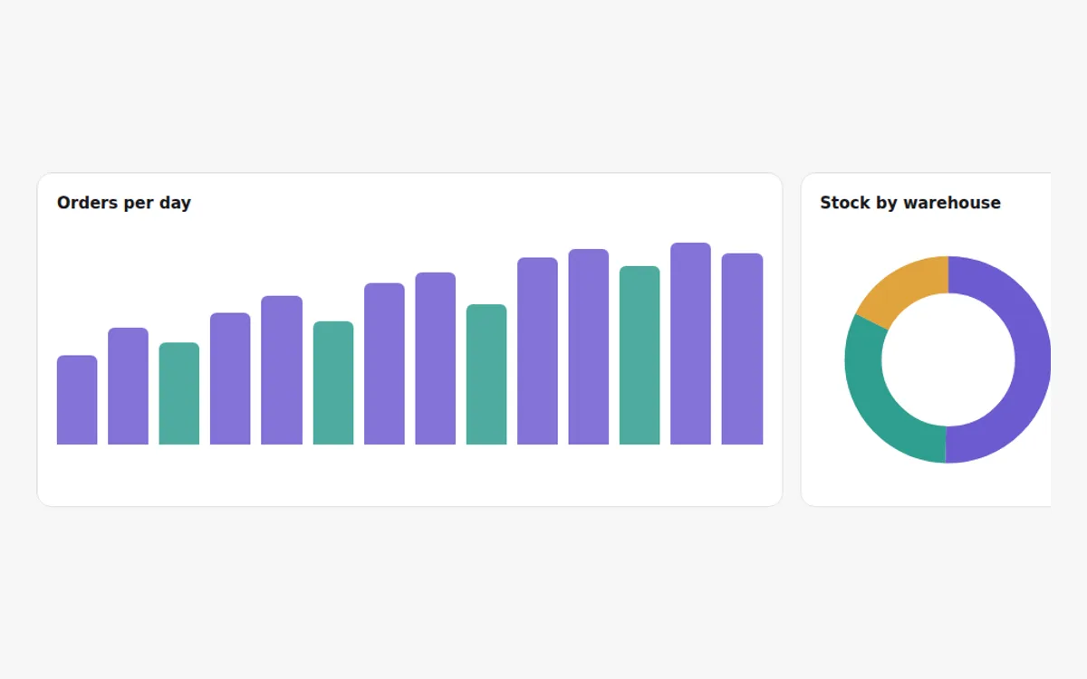
Two weeks of sample orders, one bar a day.
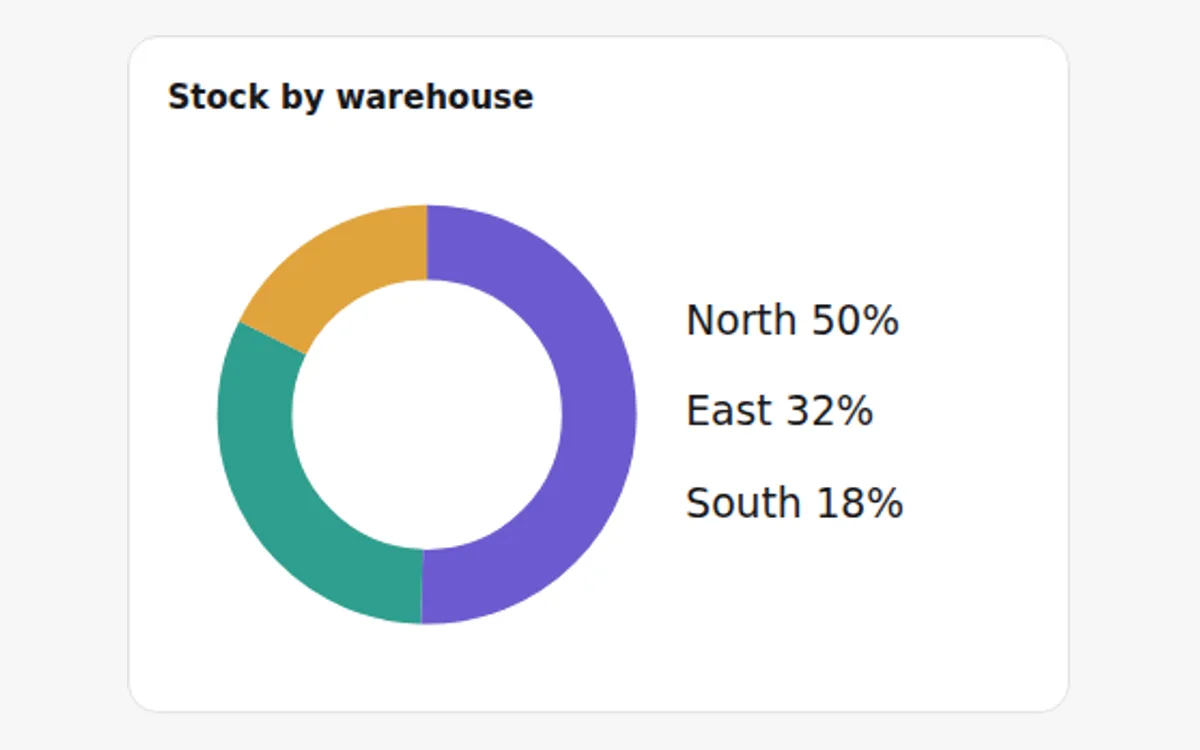
The share of sample stock each warehouse holds.
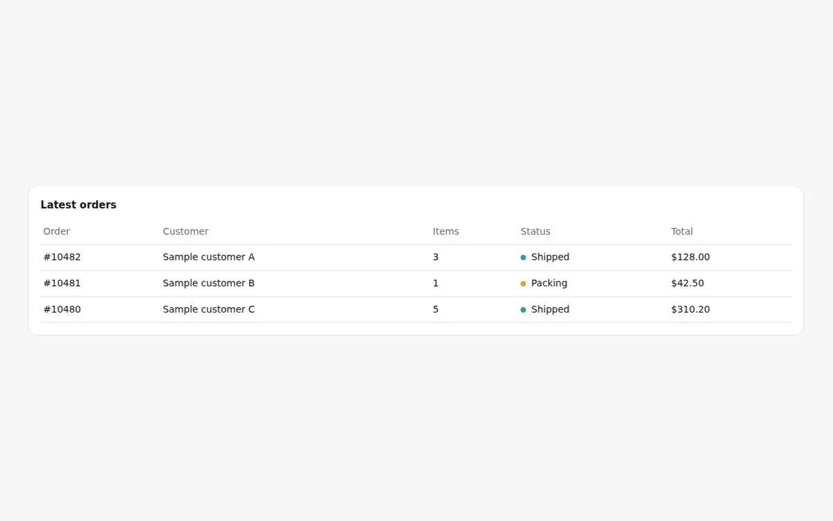
Order number, customer, items, status and total.
A product's features as tabs: a named radio group over one panel per feature, each with its title, body and image, the image optionally in a browser window.
Also: view transitions · how costs are measured · browser support · accessibility policy · five-minute setup · MCP for agents · this page as Markdown