A browser window around a screenshot or any content: the three lights, an address bar with a lock, optional tabs with one active.
every browseralways
A product's features as tabs: a named radio group over one panel per feature, each with its title, body and image, the image optionally in a browser window. The panel slides in from the side of the tab that was chosen, so going back comes in from the start. Zero JavaScript of its own: the radios are native and :has() moves the panels.
Sample features
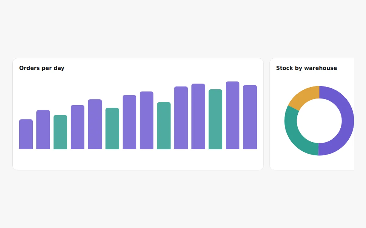
Two weeks of sample orders, one bar a day.
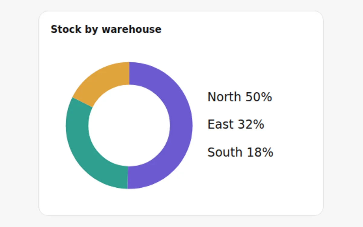
The share of sample stock each warehouse holds.
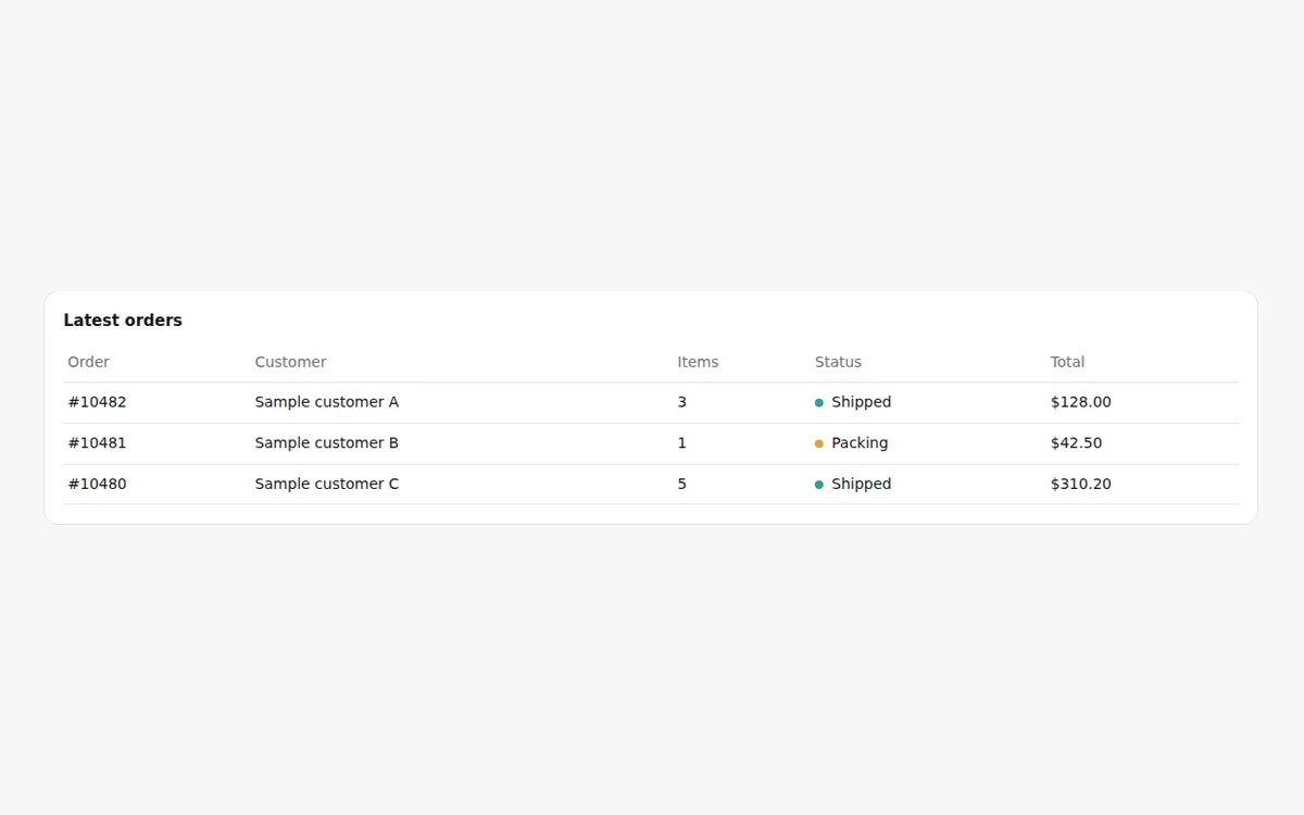
Order number, customer, items, status and total.
Live, from the library itself, at full size: scroll, hover, navigate away and back. The demo is never gated.
Variants · each row writes the attribute the prop writes; the section's own CSS answers
JavaScript of its own
0 B
Uses Reveal and the shared runtime (1.9 kB raw, once per site). With those included: 3.0 kB raw.
CSS 16.1 kB raw including the base tokens. Measured from a production build, and again in CI for every change that can move it.
Browser support
Chrome 117 · Firefox 129 · Safari 17.5; needs has, starting-style. Elsewhere: panels switch without the slide.
The demo above is never gated; the source is. With a key in components.json (see account), the registry serves it like any other item:
npx shadcn@latest add @moonarc-pro/feature-tabs---
import FeatureTabs from '@/components/moonarc/pro/FeatureTabs.astro';
import orders from '../assets/orders.png';
import stock from '../assets/stock.png';
---
<FeatureTabs
eyebrow="Features"
headline="Everything a small shop checks in a day"
label="Features"
frame={{ url: 'https://app.example.com' }}
tabs={[
{ label: 'Orders', title: 'Every order in one list', body: 'Filter by channel, status or day.', image: { src: orders, alt: 'The orders list, filtered to today' } },
{ label: 'Stock', title: 'Stock by warehouse', body: 'Low stock raises an alert before it runs out.', image: { src: stock, alt: 'Stock levels for three warehouses' } },
]}
/>Without a key the registry answers 401 with an upgrade message. Everything this section composes is free: tabs, reveal, browser-frame.
| Prop | Type | Default | Description |
|---|---|---|---|
tabs | { label, title, body, image?: { src, alt } }[] | none | The features, up to eight: the tab's label, the panel's heading and text, and an image (imported and optimised by Astro, or a URL) with its alt. A static slot panel-1 … panel-8 (n from 1) replaces that panel whole. |
label | string | 'Features' | Accessible name of the radio group. |
active | number | 0 | Index of the tab selected on load. |
frame | { url } | none | Show each panel's image inside a BrowserFrame with this address. |
level | 1 | 2 | 2 | Heading level of the headline: 2 under the page's h1, 1 when the section opens its page. The panel titles are one level below it. |
headline | string | none | The section's heading. The headline slot wins over it. |
eyebrow | string | none | Small label above the headline. The eyebrow slot wins over it. |
copy | string | none | Supporting copy under the headline. The copy slot wins over it. |
tone | 'surface' | 'muted' | 'ink' | 'brand' | unset (paints nothing) | The ground: the page surface, a muted band, an always-dark ink panel, or a deep brand panel. Each paints --background, --ma-tone-muted (over --muted, with a --border hairline), --ma-tone-ink or --ma-tone-brand (over --primary) with the matching text. With theme.css, a painted tone also re-declares --card, --border, --input and --ring inside the section. |
density | 'compact' | 'cozy' | 'roomy' | 'cozy' | Block padding and the gaps ×0.8 / ×1 / ×1.25 through --ma-density. |
align | 'start' | 'center' | 'start' | Alignment of the eyebrow, the headline and the copy. |
The section reads the theme contract (shadcn's variable names with the base tokens as fallback), so a pasted theme or one --ma-brand recolours it. Its class names are the override surface and stay stable; a named slot replaces the matching prop with your own markup.
.ma-browser.ma-feature-tabs.ma-feature-tabs__actions.ma-feature-tabs__body.ma-feature-tabs__copy.ma-feature-tabs__eyebrow.ma-feature-tabs__head.ma-feature-tabs__headline.ma-feature-tabs__inner.ma-feature-tabs__media.ma-feature-tabs__panel.ma-feature-tabs__tabs.ma-feature-tabs__text.ma-feature-tabs__title.ma-tabs__list.ma-tabs__panel.ma-tabs__tab
slot="eyebrow"slot="headline"slot="copy"slot="actions"
The panels switch in place and the indicator jumps; the head and the tab list appear without travel.
ClientRouterInherits Tabs and Reveal; nothing to wire. The checked tab resets on a new page.
Replaces: Feature section with tabs (Tailwind Plus) · Feature tabs blocks (shadcnblocks). See the migration table.
A browser window around a screenshot or any content: the three lights, an address bar with a lock, optional tabs with one active.
Entrance on scroll that plays once and stays, staggers its children, scrubs with the scroll position when asked, honours reduced motion, and keeps working after every ClientRouter navigation.
npx astro add moonarc
pnpm astro add moonarc
npx shadcn@latest add …/r/tabs.json
Tabs with an indicator that slides to the selected one and panels that fade in.
Steps on one side and one visual on the other that stays in view and changes with them, under a lead paragraph that brightens word by word as it is read.
Also: view transitions · how costs are measured · browser support · accessibility policy · five-minute setup · MCP for agents · this page as Markdown